ShopDreamUp AI ArtDreamUp
Deviation Actions
Suggested Deviants
Suggested Collections
You Might Like…
Featured in Groups
Description
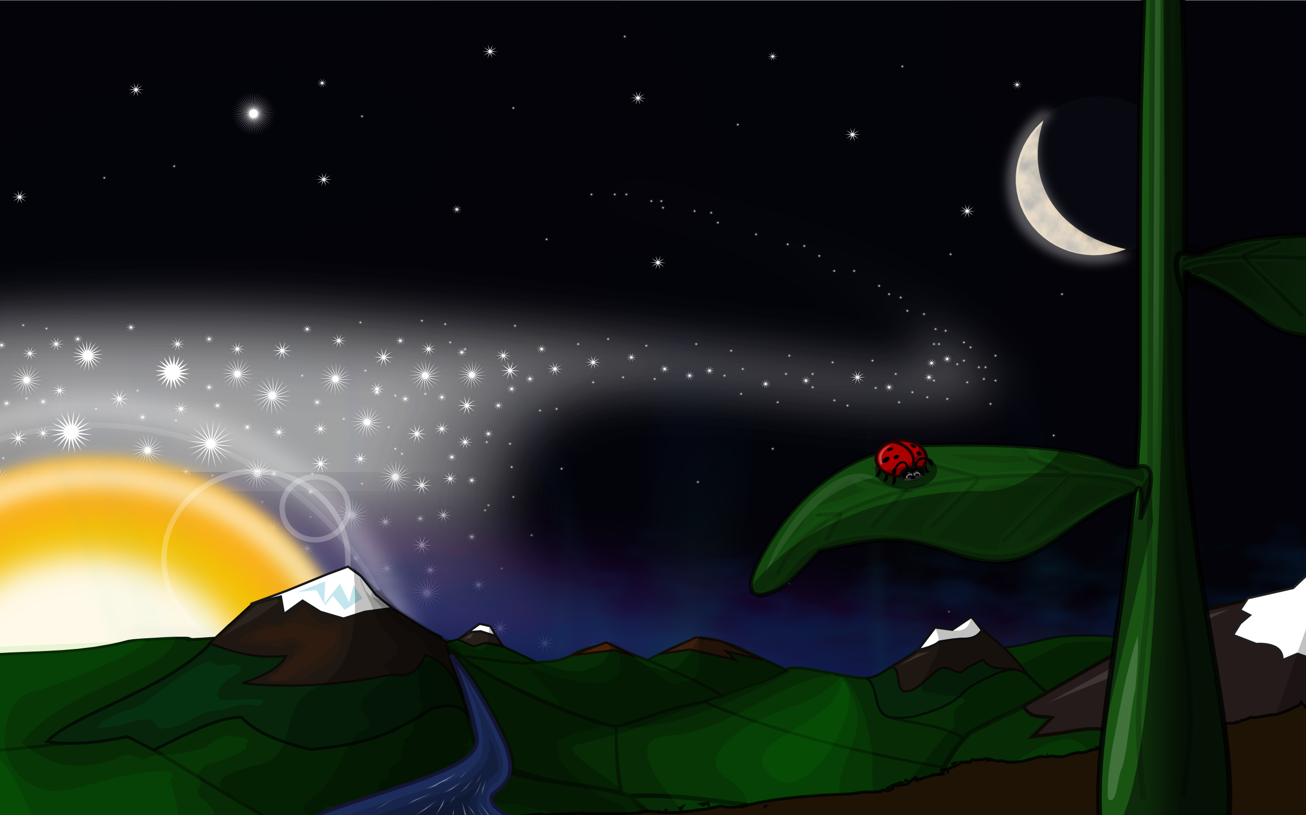
Here we have the commissioned background for the Edubuntu 11.04 Ubuntu release. It's made to envoke wonder at the vastness of the universe, from the very small to the very large.
It'll be set as the default background for the release and I'm very excited to have my art appear on so many kids computers. Here we have the svg and a large wide screen 2550x1600 png for your consumption.
Set as 'Zoom' to get the correct effect.
This art is Creative Commons, Attribution, Share Alike. Do not create a derivative from the svg unless your work is the same license and to attribute you should link to this page and print my full name.
Created in Inkscape on Ubuntu 10.10, Revision 16
Comments18
Join the community to add your comment. Already a deviant? Log In
This is such an interesting piece. It reminds me of a geography map that shows elevations with the way the colors go lighter or darker in a circular fashion. That said I don't love everything about it.
The outline around the mountain:
This is the only thing in the picture with an outline and it draws a large amount of attention to the mountain. You would think that the shading alone would do that but the outline on the mountain detracts from the white crest and makes it look flat. I would suggest trying to wrap the shading so the mountain looks round like a pointed cone instead of like an arrow.
Tones:
You might use just a few more tones to establish dark areas from middle areas because at a glance my eyes see a lot of the same shade of dark green and it makes the picture seem all to dark. If that makes sense. What I mean is that if you took this and made it into a black and white photo I think it would have a lot of areas that would show up just black.
The moon, the sun, the star trail, the plant, the leaf, even the lady bug all look perfect. I think my biggest problems are just coming in with the landscape that you've layered over them.


